Research & Exploration

The Challenge
How might we align user learning objectives with interactions on the Kopa education platform so that users feel engaged and empowered?
Outcome
Holistic understanding of user objectives, leading to solutions that address learning
Deliverables: User research, journey maps, competitive analysis, mental model, design principles, flow chart, smart customization, high-fi mock ups
Role
User experience designer: Primary and secondary research, ecosystem mapping, ideation, hifi mockups
Cross functional collaboration with founder, UX team of 2, product manager, and marketing team of 6
Time Frame
3 months and ongoing
Context
Kopa is a startup that focuses on social mobility through fractional real estate investing. Their platform provides a space for users to both select from properties to invest as little as $5 in, as well as post their own properties for people to invest in, regardless of knowledge in the industry.
Additionally, Kopa guides users to make informed decisions through their education ecosystem that consists of a section in their platform and content creation in email blasts and social media.
I was tasked with focusing on the information architecture and user interaction of the education platform, which the user group "investors" will use to learn when they elect for a deeper dive.

Focus on Waters

Challange
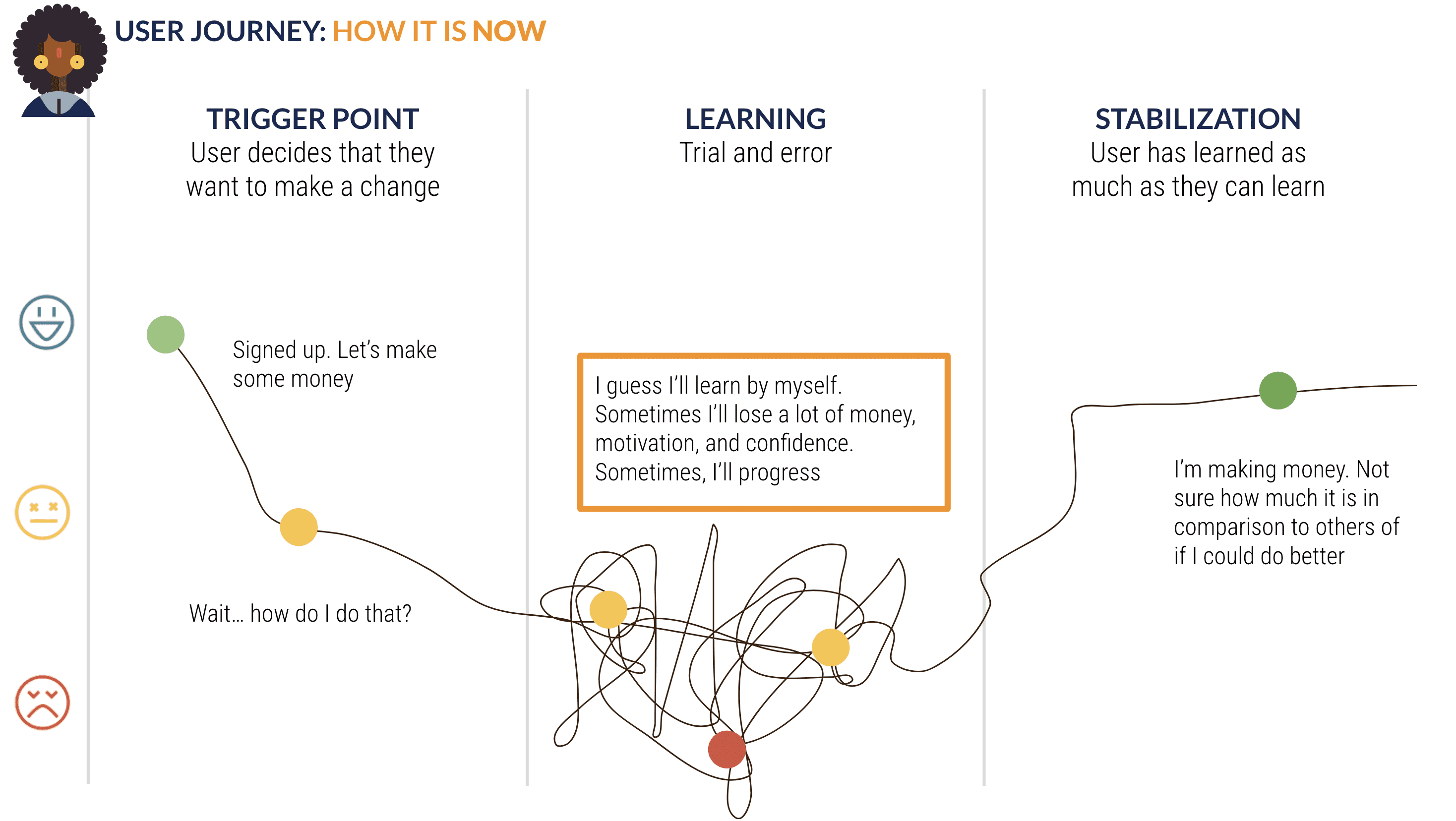
Investing is confusing, but necessary to maintain and build wealth. Users have short attention spans for new and dense topics and drop-off is common.
How do we do that?
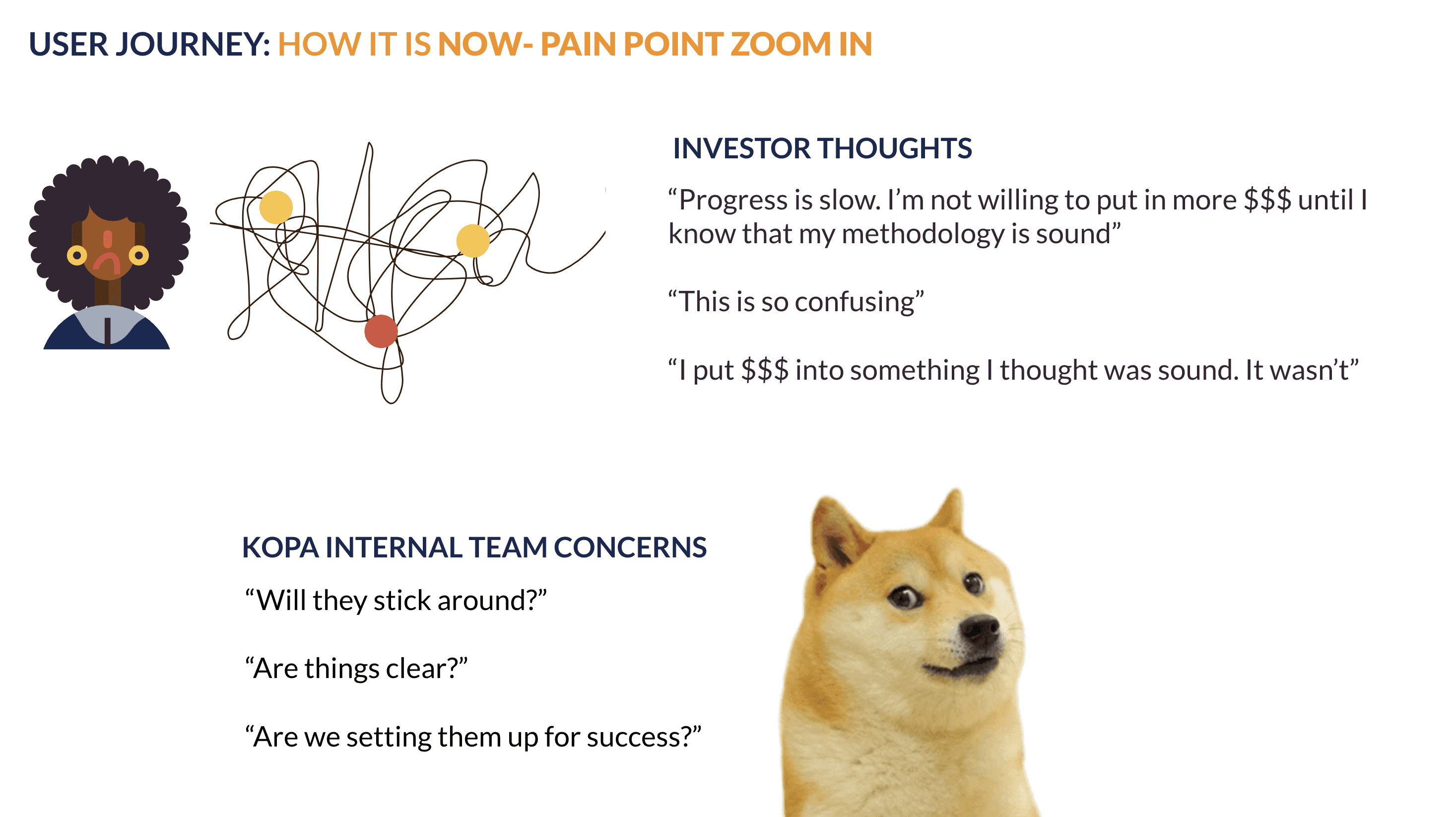
Journey Mapping and Pain Point Zoom in
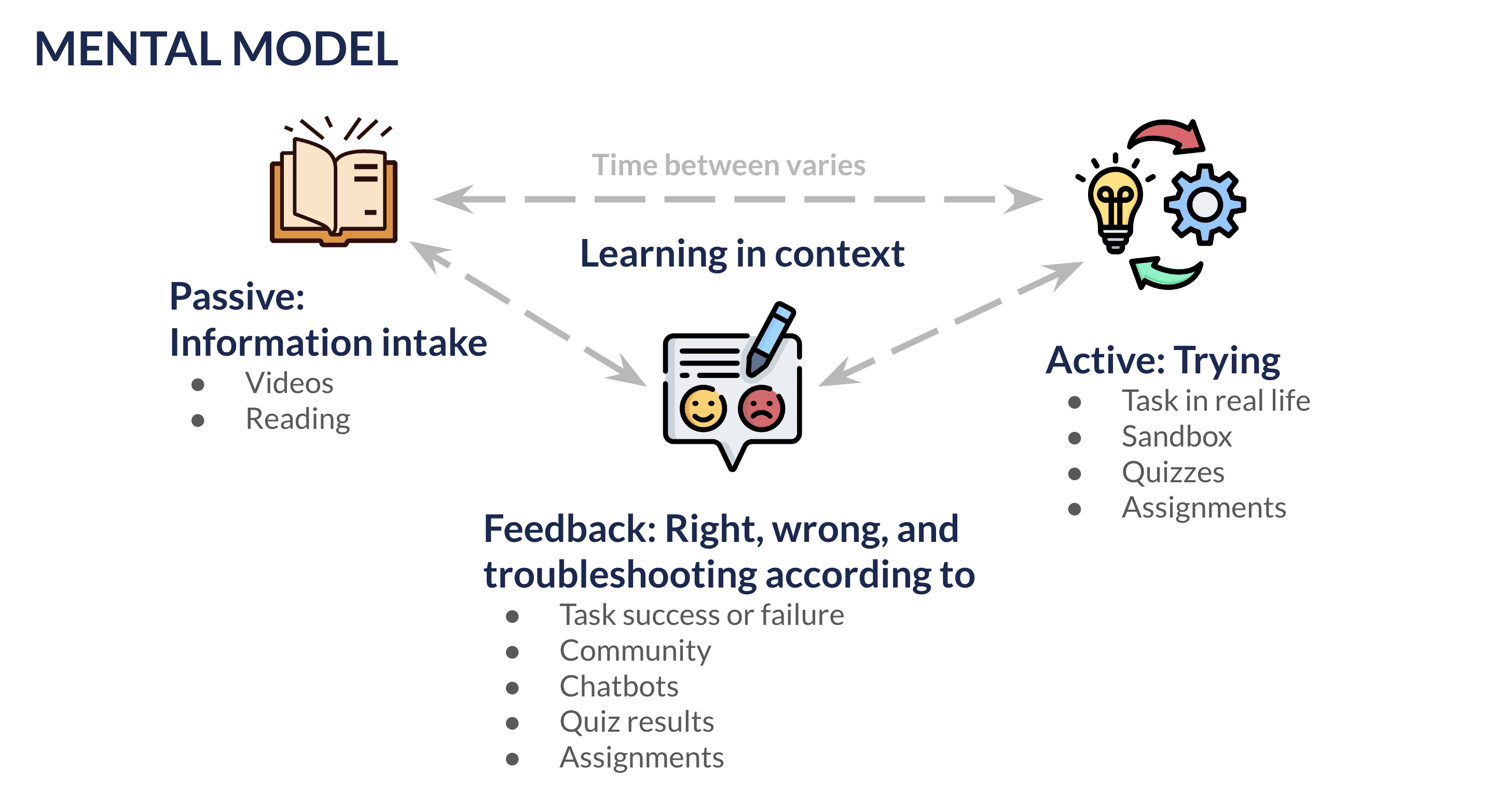
Research
Active pertains to the cognitive load being on the user, where they need to pay more attention to the interface.
Passive pertains to the cognitive load being on the interface, where the user can afford to pay less attention to follow along.

Research Findings
Talked to users.
Extensive focus groups explaining what they care about


Preferred interaction depends on what users' motivations are
If they're looking learn to immediately completing a goal or a task, they want something quick and more passive, e.g. a video or text they can skim
If they're looking to learn to build confidence or explore their options, they don't mind more active interactions, e.g. quizzes

Users will only pick out what they need
Users don't like doing double work
They will skim a video or text to extract the information they need or to determine whether or not they know the content
They will often look at everything before they dive into some things that they want to explore more

Contextual learning umbrellas all
Users are able to perform tasks in platforms best when they've learned in a similar setting
It's less cognitive work for them to figure out how to transfer learned knowledge or skills from one place to another if the learning platform and the investment platform look the same
In reimagining how things could be, we needed to see how we could address the trigger point and the learning aspect of things.
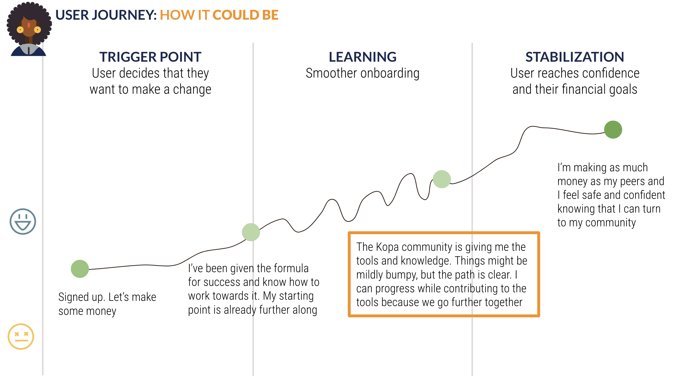
Outcome
Gathered from a series of interviews, secondary research, and contextual analysis
Scenario/use case 2 focus since scenario 1 is cross platform and social media will cover it. This interface mirrors scenario 1 in that it shows the platform combined with additional information and immediate feedback elevated and engaging learning.

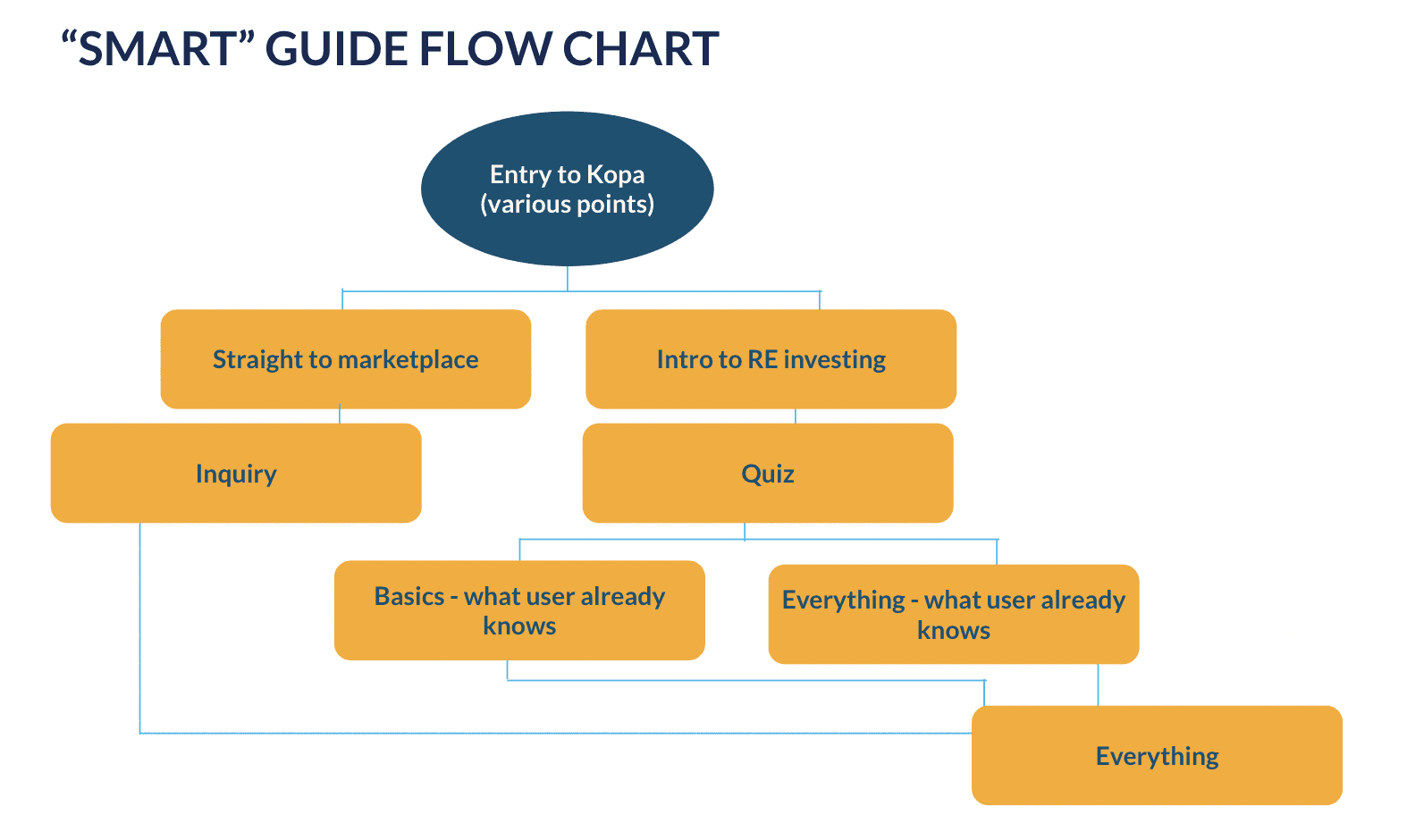
Interface
Quiz
Questions to a placement quiz with questions that extract information such as:
How much time do you have?
What do you know?


